LOGO DESIGN, VISUAL IDENTITY, PACKAGING, STRATEGY
Easy Greens
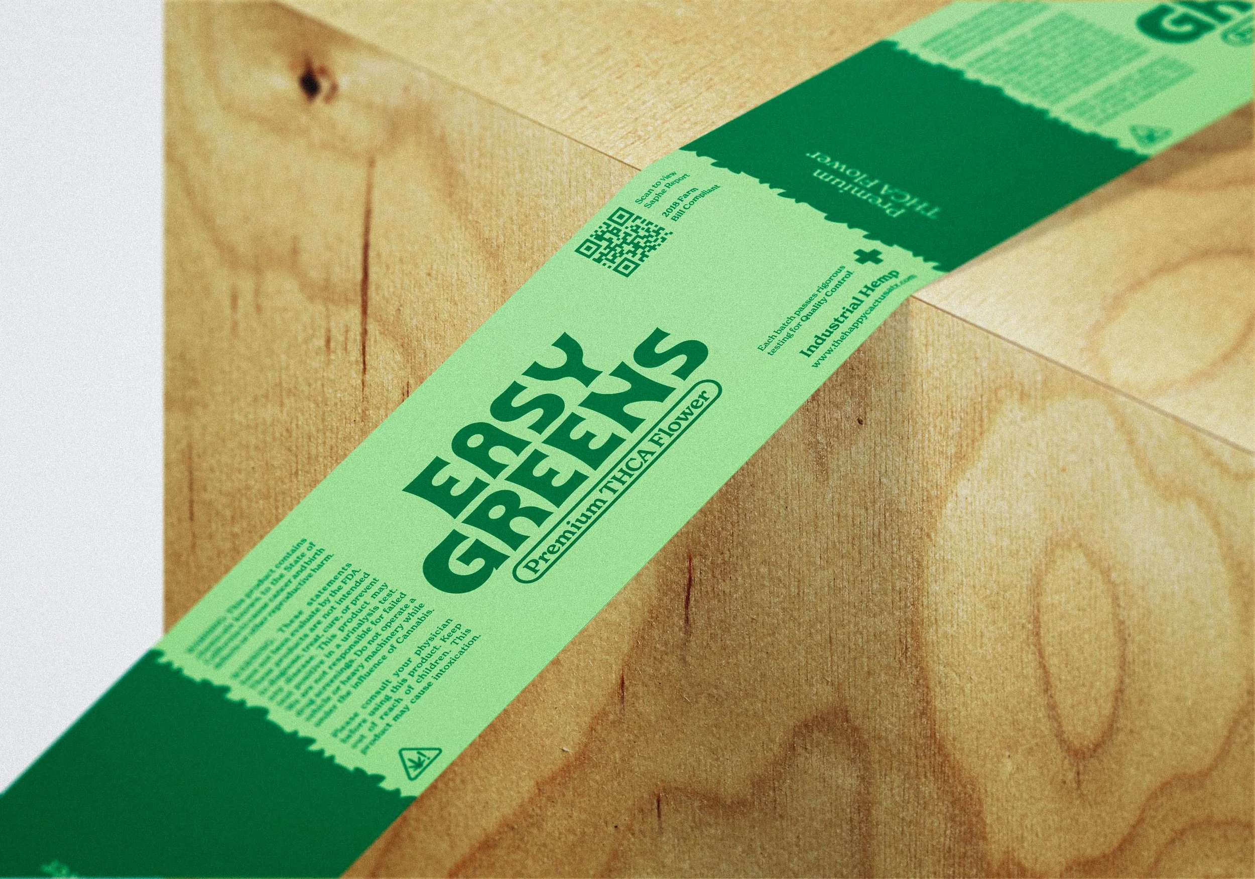
The vision for the Easy Greens product line, imagined by Todd, Amber, and Mickey of the Happy Cactus Apothecary, was to provide a simple and approachable option for those, put simply, just looking for weed.
Removed from the clinical and cliche looks of many cannabis products, the Easy Greens visual identity and packaging seeks refuge in nostalgia and sensibilities of a simpler time, when weed was just weed.
CUSTOM LOGOTYPE
ICON
VISUAL IDENTITY
EASY GREENS BUD BRUSH ©
Initially, the brief included working an organic texture into the logo. After some research and a couple attempts to deliver on the request, I concluded that the complexity didn’t align well with the vibe the THCA team was going for and we needed to pivot. Still wanting to make good on the idea, it dawned on me that a custom brush may be the solution.
This was new territory for me but after presenting it to the team, they were sold. The addition of a custom brush not only scratched their initial itch to add an organic element to the identity, it also provided them with a tool that they could easily leverage across current and future products, as well as marketing materials.
Along with the brush itself, I provided a neat ‘How-to’ document that detailed taking the brush from an outline to a filled design element. The team immediately made use of the brush and applied it to their first offering from the Easy Greens line, dime bags.
BRANDGUIDE
CONCEPTS
The duration of the project totaled a few months so naturally there were concepts that didn’t make the cut that I and others enjoyed. Below are some of those ideas:


